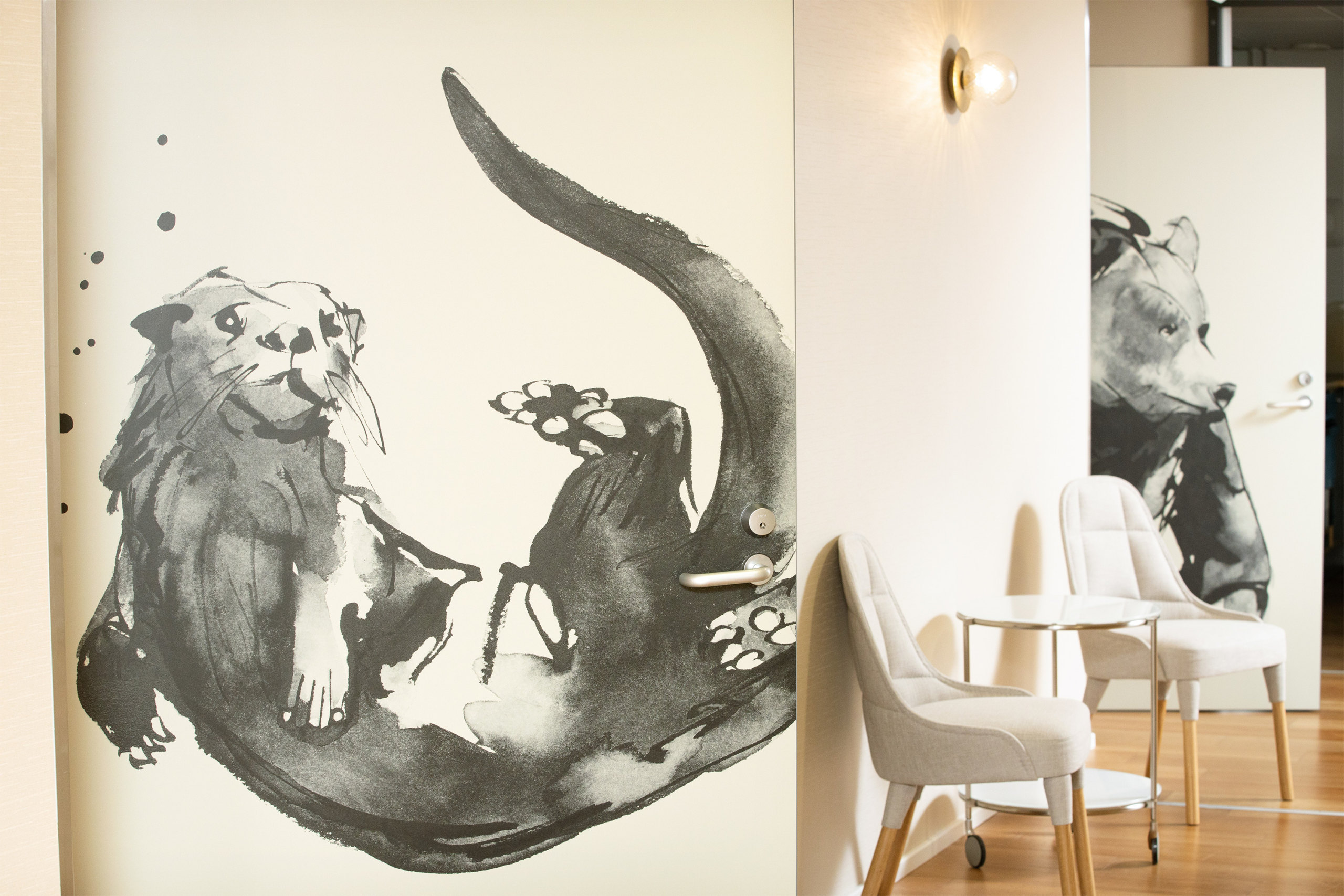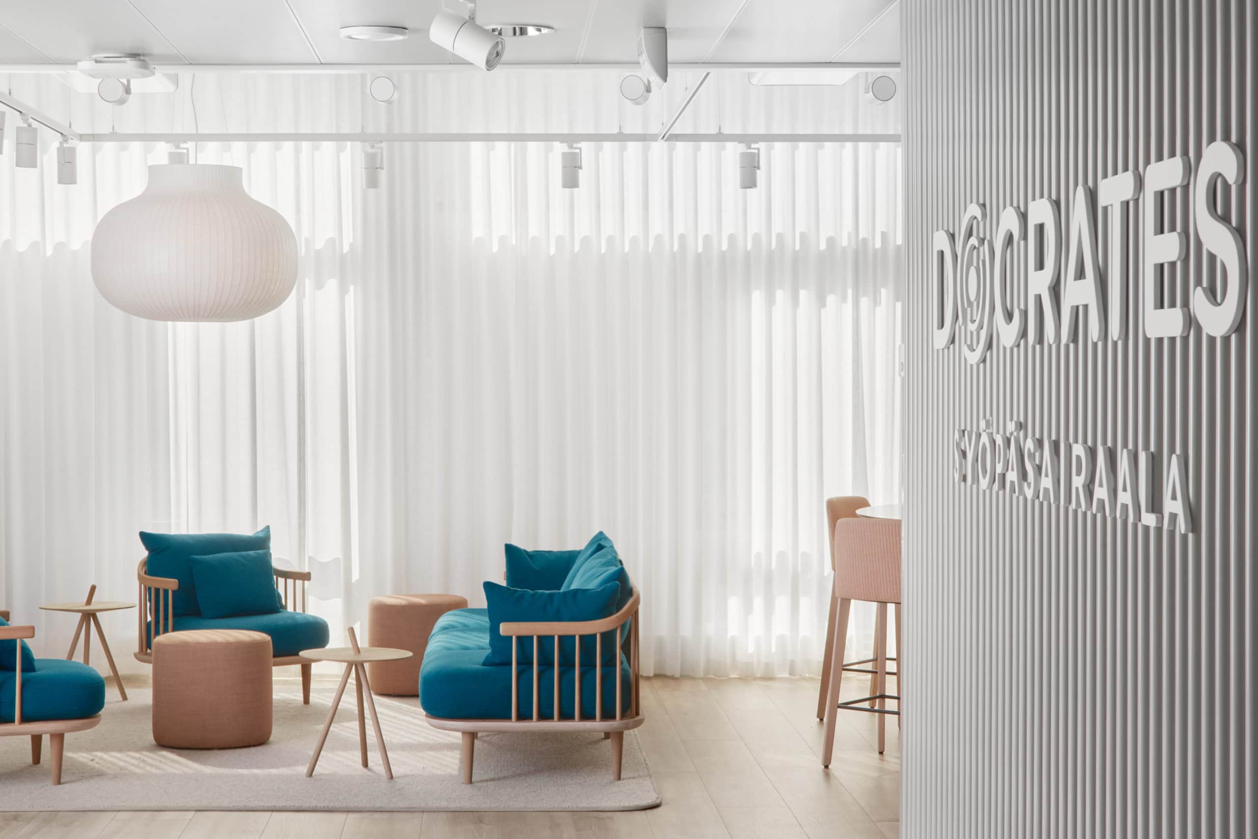
”The spaces are truly successful; now they support the level of encounters and also add more value to each encounter with their own warmth. It has been wonderful to see how users have embraced the new cozy corners, allowing everyone to have their own peace when coming to the reception if they wish.”
– Service Director, Docrates
Reasonable and sensible decisions were made in the spaces, respecting ecological values.
The spaces were designed to be classical, ensuring they withstand at least the next 50 years. The harmonious interior leaves a positive feeling and supports the Docrates human-to-human ideology.
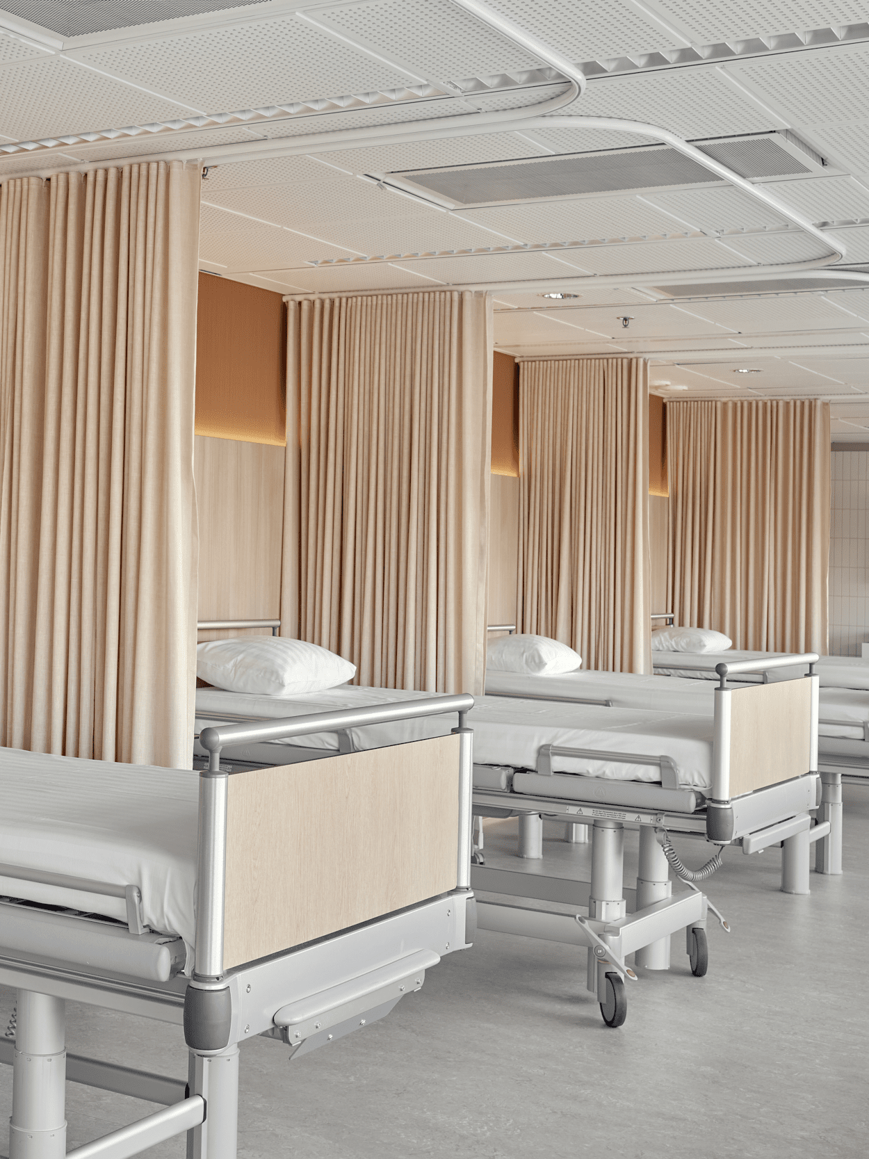
The overall atmosphere is home-like, but the material choices are suitable for a hospital environment. Special attention was paid to ease of cleaning.
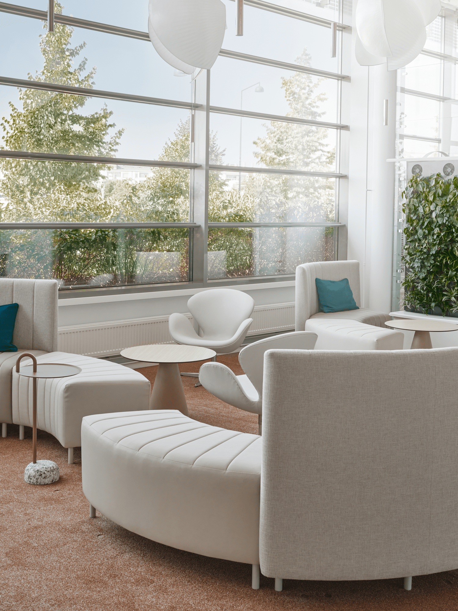
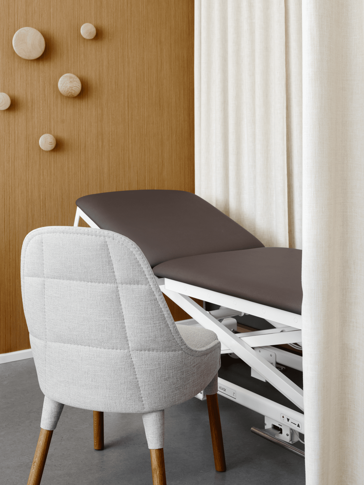
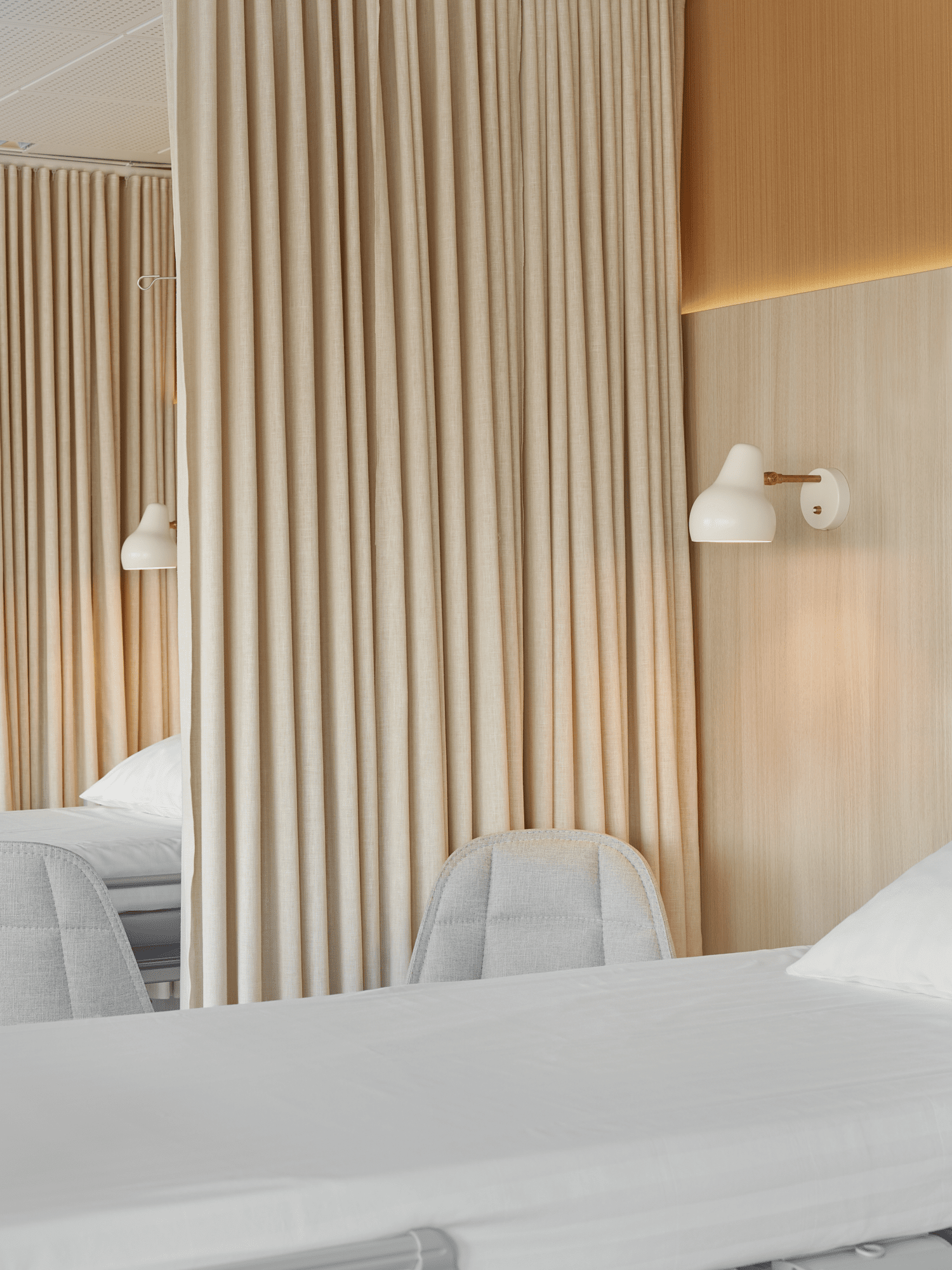
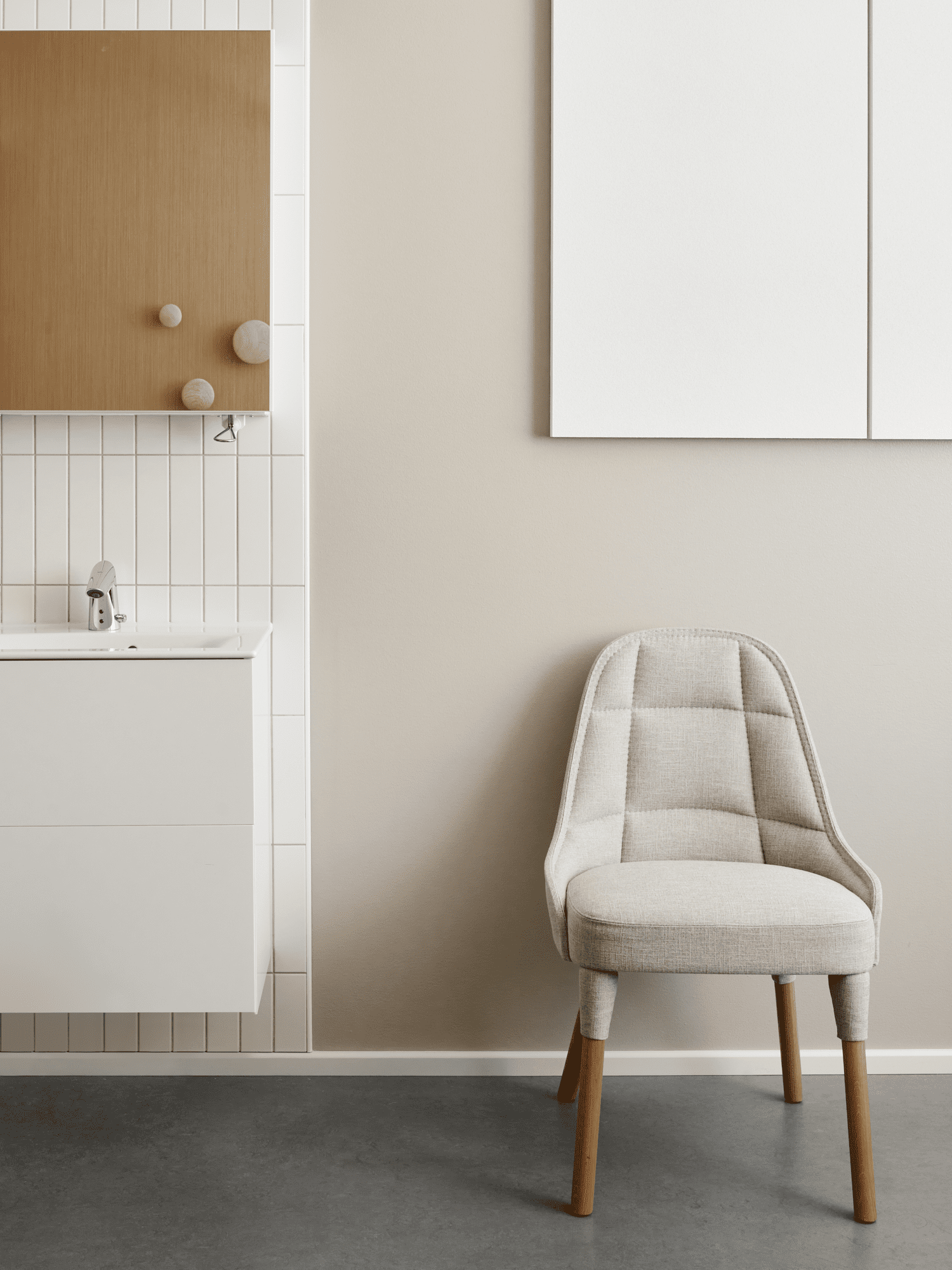
”Now our appearance, spaces, and staff uniforms are in harmony with each other. The spaces, including the recent soundscaping, now support how we care for our patients – calmly, warmly, with respect for the individual.”
– Marketing and Communications Director, Docrates
DOCRATES CANCER CENTER
2020
Helsinki, Jätkäsaari
Architecture | Furniture Design | Concept | Project Management | Principal Design | Interior Architecture | Workspace Development
Challenge
After ten years of operation, Docrates Cancer Hospital’s spaces had become cramped. The hospital aimed to expand to the third floor and relocate the administration to the nearby B-wing, allowing the core hospital functions to be designed as a more cohesive unit for patients.
The hospital, built in 2009, was tidy but did not sufficiently convey the warm patient-centric ethos of Docrates. Outdated wooden surfaces dominated the otherwise non-hospital-like ambiance.
The desire was for a more unified and modern overall look, reflecting Docrates’ renewed brand, where both patients and their families feel at ease. The goal was to bring clarity and human touch to the spaces in line with Docrates’ philosophy of “Being human, side by side with another.” The objective was to create a cohesive “red thread” – an idea to revitalize all hospital spaces, including administrative workspaces.
Benefit
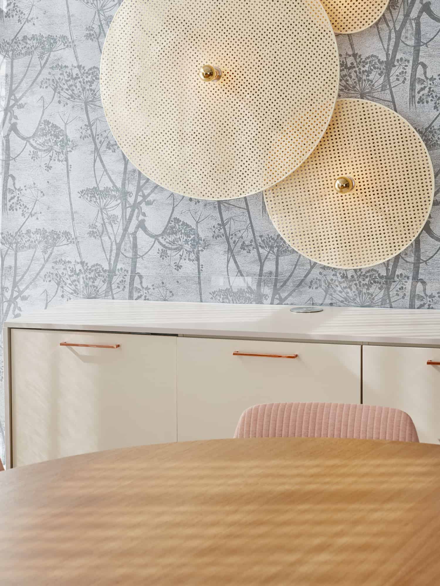
A cohesive and warm interior concept was designed for the administrative and hospital spaces. The spaces became a functional and purposeful whole, with identifiable interior solutions to help patients navigate the areas. The design featured recurring circular shapes, a harmonious color palette, green walls, and distinctive, custom-built furniture. The healthcare staff and Docrates’ transformation team participated in the planning to ensure the appropriateness of the chosen solutions.
Human-centricity was emphasized through homely interior choices. Warm wood, loose carpets, soft and light-looking lights and cushions, as well as home-like textiles, softened the environment. The spaces were created not only beautiful and home-like but also sustainable and sensible. The design respected the building and existing materials, turning the hospital into an environment reflecting Docrates’ values of service speed, human-centricity, and responsibility.
The initial impression of the administrative spaces is also harmonious and clear: light wood and harmonious materials support Docrates’ turquoise and orange visual identity. Docrates’ logo catches the visitor’s eye through the glass doors even before entering the space. The combined lobby and kitchen area with recognizable coffee points serves both individual visitors and staff during larger events. In addition to classic interior solutions, the office spaces were built into a cohesive environment supporting tranquility and relaxation for appointment schedulers and other administrative teams.
